HARPOON BREWERY
[CASE STUDY]
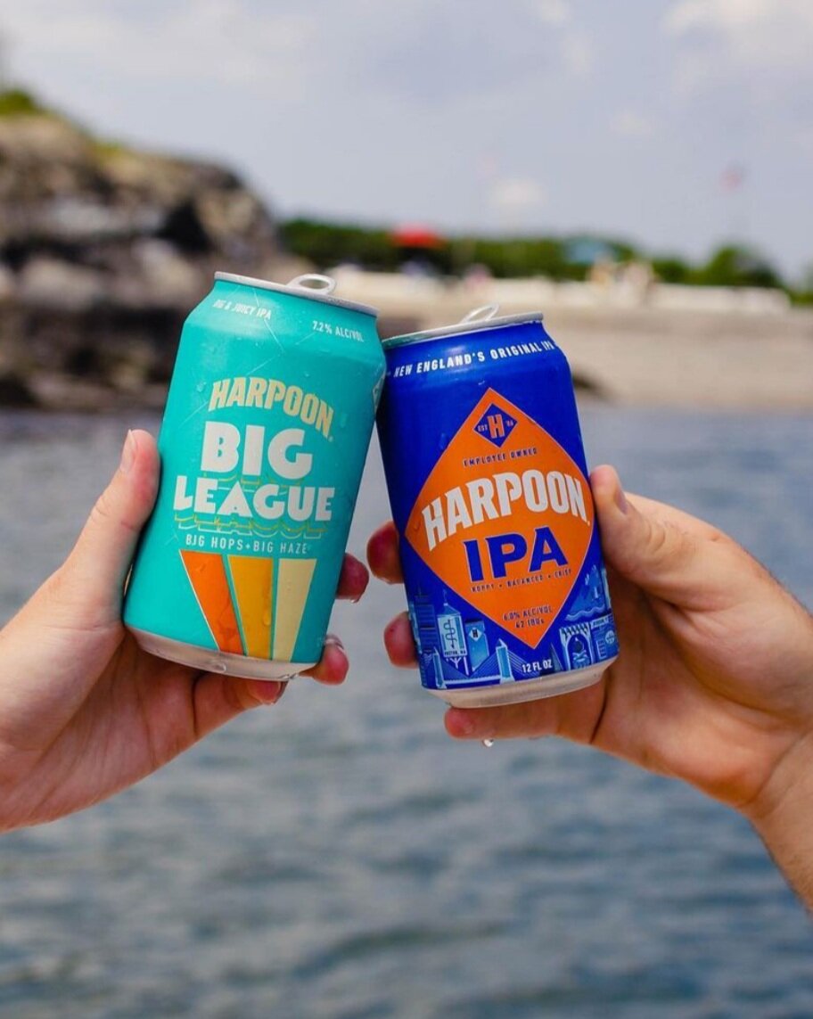
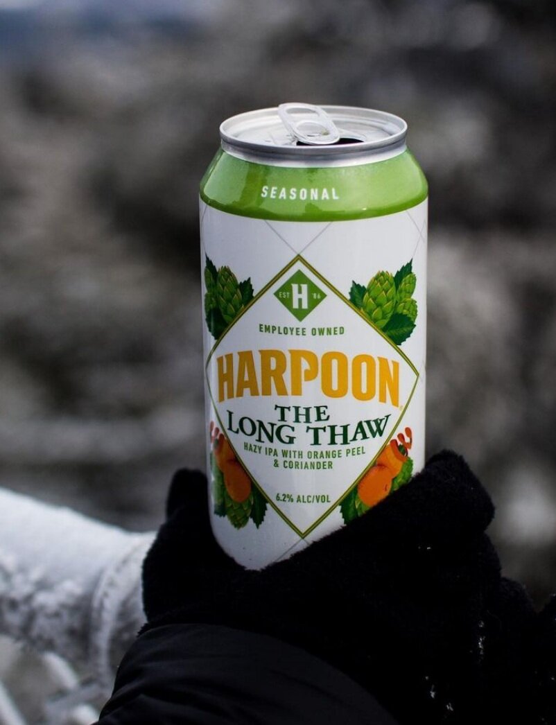
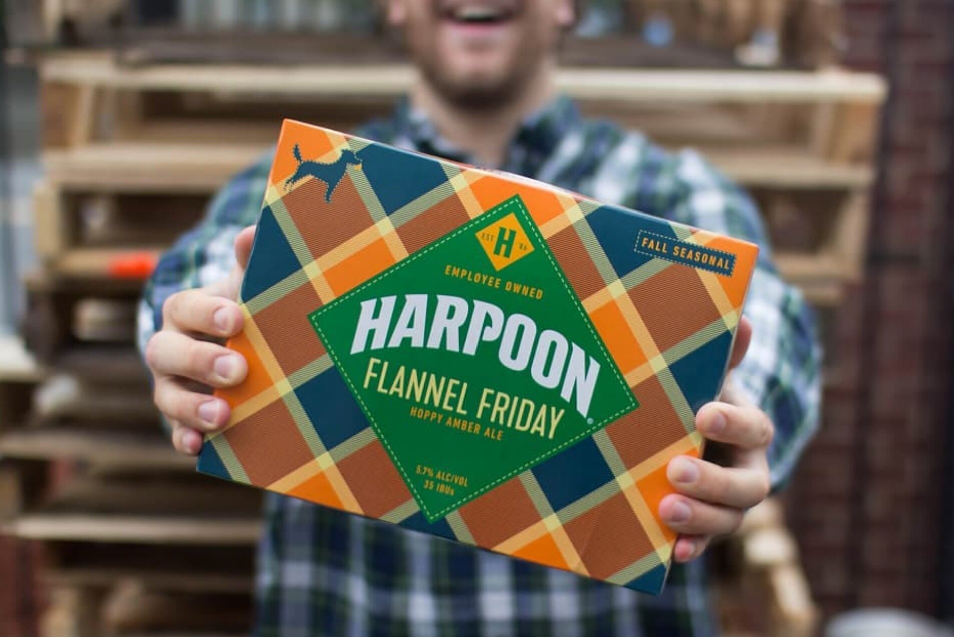
Harpoon wanted fresh branding and packaging to clearly express their New England roots and pride in local community.
PROUDLY NEW ENGLAND, PROUDLY EMPLOYEE OWNED ↑
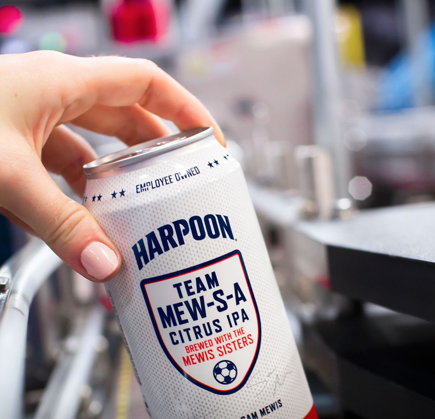
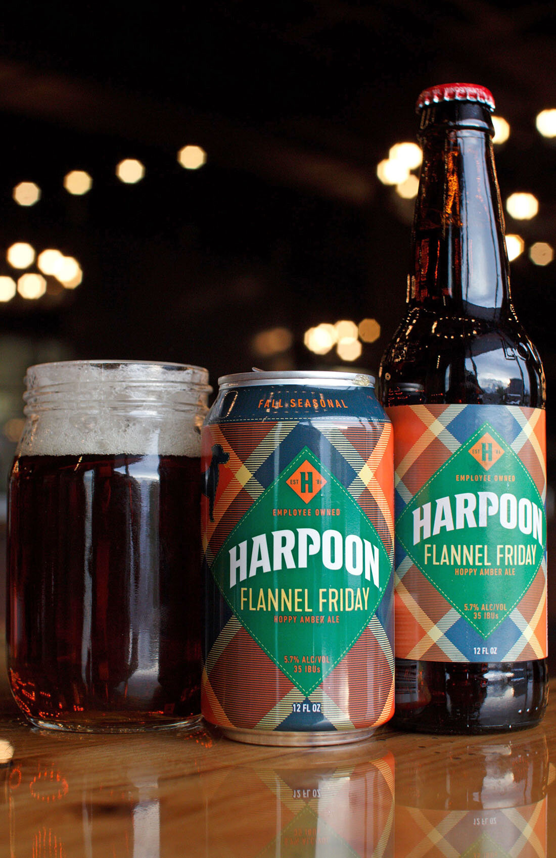
This new design communicates the two things Harpoon cares most about and that their previous packaging was missing. It brings their local pride and community engagement story into focus with illustrations of New England landscapes and their iconic brewery. It’s stamped with a seal of employee ownership, and honors the history of Harpoon’s long-running product by referencing the diamond pattern.
IT’S IN THE DETAILS ↑
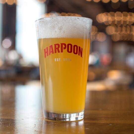
The addition of a harpoon in the bowl of the P pays homage to the widely recognized harpoons on their beer taps and Boston brewery tank, and of course their name. The client loved it and applied the change across their entire brand!


